Pages

home about us portfolio tutorials diy home dec faqs contact Image Map

Friday, October 11, 2013

Lessons Learned - Trends, Likes and Seashells

Every once in a while, do you have a question that seems to have no answers? I'm in one of those places right now, in more than one area of my life. One of those areas has to do with the repainted and updated furniture we do.

Have you ever finished a piece, sat back, admired it and then.....sat back and scratched your head when something so gorgeous just doesn't go out the door? I have had this happen more than I like to admit lately; a Seize the Day Table that we revamped with a chalkboard-looking top and also with a periwinkle butterfly stand.


Why do some pieces fly out the door so quickly, while other sit around like the wallflower at your junior high dance?  Is it color, shape, design? Who knows? Maybe it's all of those - or none. What's not to like? Chalkboard, butterflies, periwinkle blue.  

Maybe it's just a fact of a DIYer's life: there are just some pieces that have a hard time finding a new home! I just don't get it. 

Maybe it's just MY emotional attachment to the colors and pieces. Or the time invested.

Remember opening a new box of 64 crayons? Yep, the big one! That periwinkle blue was one of my favs! That's why it didn't make sense to me that the butterfly stand wasn't selling.

Finally coming to grips with the fact that the pieces weren't going to sell as is, and putting our faves aside, we repainted. UGH!! The Carpe Diem table hasn't gone live yet, but the butterfly stand sold within 24 hours of repainting the periwinkle a soft black.


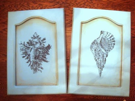
I think the hardest redo of a redo was a pair of cabinet doors that we repurposed for wall art. I thought it was a great idea. I spent hours learning the transfer technique for the shells. I loved the soft arch at the top of the door. That, coupled with one of my favorite colors, sea-glass green, LOVE!

shells, transfer, door art

I still like them, but they just wouldn't move. Well, the other pieces moved after a redo of a redo. Maybe these would, too. (Insert sad face here)

I took the leap. I mixed up some chalkboard paint. Don't hate....I did try some spray paint chalkboard, but it came out shiny and the chalk wouldn't work on it. So I mixed up my own. (Insert happy face here)

We all are aware that chevron is so trending. The charcoal, coral and white desk we revamped soled almost immediately. You can read about it here:  http://bit.ly/1hI8O3H  It was worth trying.

I also found a chevron painter's tape, made by Frogtape. It's not cheap, and it's not easy to find, but it's so easy to use. It comes in three different shapes. I will definitely be using it again!  

(I pulled this image from their website.)

chevron, painter's tape, frog tape

The centers of the doors were repainted with the chalkboard paint. The chevron tape went over the sea-glass green and was painted with a dark teal.  They looked so different!

chevron, chalkboard

And, guess what? They were gone within 5 minutes!! No kidding?!

Sometimes it pays to put your emotions and likes to the side, and take an objective look at things. Hmmmm....that sounds like more than a painting lesson; that's a life lesson!  Lesson learned!


Thursday, October 3, 2013

Mirror, Mirror

With the holidays approaching I'm seeing a lot of white, shimmer and glitter. Here's our contribution. A white, shimmery, lux-looking, but affordable piece. This entire project cost was around $15. I love projects like that!!

if you're like me, sometimes, you just need to do something a little different now and then. If you DIY long enough, eventually, you'll find yourself branching out to try new things. This was one of those projects. Ready for a break from detail painting such as our Count Your Blessings Cabinet - http://bit.ly/GC3TFg

This is one of the projects where the idea was great, but the actual process made us break a sweat. It was a LOT of work. I have to admit that we did do another project very similar to this not too long after. Some of us just don't learn very easily.

That was the case with this vintage round coffee table. We found it in a local antique shop in the clearance section. As you can see, the top was leather, but had seen much better days. It was ripped up and had burn holes through it.

vintage, updated table, painted furniture, mirror, mosaic, updated, upcycled

Sunday, September 22, 2013

Don't Fear The Great Paint-chip Wall

First, I have to apologize for the text-heavy post this week. Sometimes it takes some 'splaining. Bear with me.

You are so thrilled! The creative home decorating muse has struck! You have finally settled your heart on wall color(s) that satisfy the inspiration! A gorgeous sea-glass green will look AMAZING with some dark teal throw pillows. You can almost hear the angels sing, “Ahhhhh....” as you near the paint display. 

As you stand in front of the display looking for the color that’s been haunting your mind, you choose three different colors. Once you have them in hand, you realize that apart, the look the same, but when they’re in your hand, the differences are unquestionable. The one on the right, that looked so perfect, looks blue compared to the one in the middle. The one on the left has mysteriously taken on a yellow tone. It doesn't look green at all! Now what?

You’re sure that the store employees think you’re crazy, arguing with yourself over which one of the three colors will look best next to your new, fluffy comforter. You ask the paint-mixer-lady for some guidance, only to discover that her knowledge of paint chips is equal to yours. Getting more and more confused and frustrated, you leave the store sans paint. Deflated, you think that maybe the current color on your walls isn't so bad. That muse, yeah....she's gone!


If you’re a DIYer, like I am, this scenario is not at all far-fetched. How do you decipher the monstrosity of all those paint colors? They look so beautiful all lined up. But once you enter their realm, they turn into something to be feared and dreaded.  

Without getting too tied up in color theory, light absorption, reflection, etc. let's dive in. Although those things can be important, but they aren't really going to help you when you’re standing in front of that imposing multitude of paint strips.

In my experience there are a few things that have helped me. Here are some tips and tricks I've tried that might help with your next excursion into the paint department.


First, the paint strips themselves. Their setup is pretty simple. The main color will be one toward of the center of the strip. There are lighter and darker colors on each end. Even though each strip still has a light end and a dark end, the base color will be the one(s) in the middle of the strip.


Now, onto the great wall of paint strips:


  • As you stand facing the display, it might be that the reds are firsts, or the blues, or the greens. That doesn't really matter. However, take note that the truer, purer, jewel tones are either at the top or bottom of the display. As the paint chips move to the sides, they flow from one color into the next. Think of the rainbow: ROYGBIV. Red will flow into orange. Orange will flow into yellow and so on. So, for example, if you pick up a green chip that’s too yellow, yellow is next to green on ROYGBIV. To get a bluer tone of green look at the top of the wall to find where the blues are. If you head that direction, those greens will be bluer than the one in your hand.
  • The next key to unraveling the wall is this: the truer colors will usually be at the top of the wall. As the colors go down toward the floor, gray is added. This makes the colors more muted. So as you look at the color in the middle of each strip, they will get grayer and more muted as they go down the wall.
  • Remember, the main color of the strip will be in the middle. Surrounding each main color, will be lighter shades toward the top and darker shades toward the bottom of the strip. So if your main color of the strip is too bright, head toward the floor. The reverse is also true, if your color looks too muted head toward the top of the wall.
  • You may want to ignore the colors that are out there all on their own. Those special mini group titled “Colonial Revival.” and its friends. They’re there to distract you from the color that’s warming your heart. They’re there for the painters who wander in without any kind of plan.


    Now for some indispensable tips:

    I read online that 40% of a paint store’s profit comes from consumers making mistakes in choosing paint color. Yes, you read that correctly; 40%!! To help lessen the probability of your falling into that ditch, here are a few little tips. 


    • If you're matching your paint to something in your room, take a swatch of fabric, a pillow case, a wallpaper sample, etc, with you. Don't rely on your eyeballs or your memory when selecting paint.
    • Never us a chip to make a final decision. You're much better off buying a sample jar of your selection. Take your sample home, paint it on two pieces of foam core. Don't paint it directly on your wall. If you do, there may be some visible ridges where your sample stops. 
    • If you're going to be using a paint roller, use a roller for your foam core samples. Believe it or not, application methods have an effect on how the light plays on your paint. 
    • Once your foam core samples are dry, place them on your walls, meeting in a corner. This way you can see how your paint looks in your room - where you're using it, under your lights. Your colors will look different in your space than in the store. You will be able to see how the sunlight and your room light interact with the paint in your space.
    • Live with the colors on the wall for a few days to a week before making your final decision.

    Hopefully, these tips and tricks will help demystify the great wall of paint chips, and help keep you from being a part of that 40% profit!

    Please leave your comments. Feel free to share your paint-choosing tips or tricks!

    Monday, September 16, 2013

    Updated Cabinet into Acorn Wreath Storage Cabinet

    This cooler weather already has me thinking fall. Football, apple cider, and falling leaves.


    I found this cabinet in a local used furniture shop. This little vintage 1940's piece was beat up, unloved, and stuffed into a corner. Despite that, it was priced at $14.95 It had a maple top, vintage shabby chic style and a great shape. I figured we could do something with it. We were so excited to get started that we forgot to take the "before" picture.  (Sigh...once again excitement overrides know-how!)

    An acorn wreath graphic from The Graphics Fairy was our inspiration for this piece. http://thegraphicsfairy.com/search/  Her site has amazing vintage style free graphics. If you haven't visited her site, you should!  I used one of her bee graphics for my Dutch Back Bee Chair. You can see it here -   http://tinyurl.com/qbbrg9k

    The first thing on our list was to give it a good cleaning. The bottom of the cabinet was given two coats of cream color paint, the knobs were painted a light sage green. Both were then sanded back to bring out the details and to give the new paint a shabby chic finish.

    Two of the most interesting updates to this piece were the top and the insides of the storage area. We wanted to do something special in the back of the storage area. We cut a piece of foam core to the size of the back.  We wrapped the foam core with fabric, hot gluing the excess fabric on the back of the foam core. The wrapped foam core was then hot glued into the back of the cabinet.

    fabric, covered, foam core, shabby, baskets

    The baskets were purchased at a local department store. They matched the fabric perfectly!

    The other area that we wanted to bring attention to was the maple top. That's where the graphic came it. 

    acorn, acorns, wreath, oak leaves, count your blessings, cabinet

    Count your blessings, acorn, oak, hand painted, handpainted, shabby chic
    I wanted to allow the wood top to become the highlights in the acorns and wreath.Using a chocolate brown craft paint, I sideloaded the brush and went to work, painting the shadows. I was a little overly ambitious. This only took about 4 hours!!! But it turned out so gorgeous!

    When it was all finished, this is what it looked like - before it found a new home 


    So, although I hate to think of what November brings, blechhh!  I love the way this cabinet turned out!

    Saturday, September 7, 2013

    "Free" Dandelion Storage Table

    (or Dandy-Lion)

    I purchased this fixer upper on a local sales site for $2.50! Yes! That's right! $2.50!! Beat up, missing hardware and some loose joints, it was ready for a facelift! 

    I was so excited to get started that I forgot to take a before picture. Here it is glued up, wrapped and ready for its re-appearance! 

    After prepping and priming, the lid got a fresh coat of white paint, while the drawer front, top and sides were dressed in a medium gray. The inside of the storage area and the inside of the drawer got a coat of  sea glass light green.


    Wanting to customize the "new" little guy, I downloaded a piece of clipart of a dandelion with the seeds blowing off into the air.  I transferred this design by tracing the design on the reverse with a pastel and then taping and transferring the design onto the lid.  I also traced some of the seeds onto the top of the stand.

    The lid still needed a little something. The word "free" came to mind to convey the seeds drifting off into the air.  The font I chose is called Freestyle (I just now noticed the name...FREE).  I transferred this to the lower right side of the lid, using the same method as the dandelion.

    All of the designs were handpainted in the same medium gray as the base. The seeds that flowed onto the top were painted in white.

    Since the stand was missing some hardware, I picked some up off of ebay. (That search took hours, because I didn't want to have to fill and drill new holes.)  

    Ready for the "after"?  


    Here it is!


    The top and lid got a couple of coats of poly and it was off to its new home!


    I LOVE seeing pieces in their new homes!!


    Friday, September 6, 2013

    Gray and Coral Chevron Desk

    We're celebrating! Hard work pays off! Our first feature!

    This little beauty came to us in not-so-nice condition. Someone had loved it very much. It had stickers on it. The finish was worn. If I remember correctly, there was still a couple of lost crayons in one drawer.


    (Wait, let me grab my coffee...okay, ready now.)

    I LOVE updating pieces; seeing the color go on and watching your vision for the piece play out is so rewarding, However, I really dispise the prep work for painting a piece.  Removing stickers, sanding, priming, filling in big chips, regluing loose joints, on and on and on. Why can't we just paint??

    Often, there's more time and effort in prepping the pieces than in the actual delightful, relaxing painting. I know, right about now, some of you are thinking I"m crazy. You could be right, but I actually dig (like that throw back word?) the painting process.

    After prepping this little desk (UGH!), Olivia had a vision for it. (She takes after me...) She painted the base a medium, charcoal gray. The top was given two coats of vivid white.It was coming along beautifully. But there was one thing wrong. Looking a tthe colors and the revamp plan, the Colonial knobs were like a burlap sack with a woman's formal gown: they just didn't match.So, they were primed and painted white to match the top. They looked SO much better!! Now the purse matched the gown!

    Sometimes, I prefer handpainting, such as in our Fleur De Lis Table http://bit.ly/15AZtVA but not always.

    Sometimes a stencil is what a piece needs. That was the case for this desk. The next step was the most fun. Using a chevron stencil by Cutting Edge Stencils found here on their website http://bit.ly/15EjHUk We have used their stencils for other pieces, that we'll share in the future. Their stencils are ahhh-mazing! They're bendable, strong, and they clean up easeily.  For the desk, we wanted an oversized chevron so we purchased the larger one from Cutting Edge. Using a trendy bright coral, we gave the stenciled area two coats of paint. After removing the stencil, there were a lot of bleeds and uneven edges. It's frustrating when you think a piece is going to be done and BAM! More work; but thankfully, the straight lines in the stencil made it easier. All it took was some painter's tape and a paintbrush to clean them up.

    chevron, stencil, coral, gray, update

    I'm feeling better now.

    In the end, it all came together into one little charming piece. And, all of that hard work: sanding, priming, unsticking, regluing - yeah, all of that paid off! Not only did the desk find a new home, Cutting Edge Stencils gave us props on their blog! Take a look! http://bit.ly/15J2K49 We are so excited, humbled and blown away!

    gray, chevron, coral, stencil, desk, back to school, update


    I guess Mom, Dad and the teachers were right; hard work DOES pay off. Now, go do some hard work, enjoy the process, and get some kudos!


    Wednesday, September 4, 2013

    LABOR Day DIYs!

    I hope you all had a wonderful Labor Day!

    Mine was definitely a LABOR day. We're taking a small break from the vintage furniture painting that Sow's Ear usually does, and we're making some updates around the house. This weekend was a crazy-busy one. We did manage to squeeze in a family picnic in between all the projects.  

    Stephanie, over at By Stephanie Lynn @ http://www.bystephanielynn.com/2013/09/sunday-showcase-party-210.html is hosting a linky party, asking her readers to share their recent projects. I'm going to her party!

    Ready to take a peek at what we accomplished? It might not seem like a lot, but it was labor and time intensive. I have the blisters to prove it!

    I'm very frugal when it comes to anything! Honestly, unless it's something that I fall absolutely in love with, I'm always looking for a way to do it myself...CHEAPER!

    First, there was the stairway/hallway wallpaper project

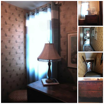
    I don't have any "before" pictures, but believe me the 1980's wallpaper that graced this space was not graceful in any way. It had a cornflower blue, mauve and beige color palette. Not horrible, but the crayon, pencil and tears were not helping matters.  I had the strange blue/green Berber carpet that had to stay. At our local Habitat Restore I found a paisley wallpaper with the same strange teal color, along with tan, bronze and gold. The best part ---- ONLY $1 per double roll!!  Yep!  LOVE it!

    Although this seemed like a straight forward project, there were angles, cut ins, railing brackets. It was really time intensive, but I think it turned out very nice.

    wallpaper, redo, update, DIY


    By the way, see those nice teal knobs on the dresser? They used to be white! I colored the white glass with a teal sharpie, let them dry overnight, baked them in a 350 degree oven for 30 minutes, and VOILA!! New, updated, color-matched knobs!

    Second up -- the Dreaded Deck

    It was painted 2 years ago and definitely needed a new coat of makeup! I repainted the floor; UGH!! Drudgery! Then came the fun part!  Putting the eyeshadow, liner and blush on the foundation.

    I purchased a 6 by 8 foot outdoor rug at Home Depot for just over $17  http://tinyurl.com/kun6fbf .  I made a stencil and with a couple of cans of paprika and white spay paint, created a one-of-a-kind outdoor rug.  More updates included the pillow covers for the reading area. Fabric Guru ( http://tinyurl.com/l3nwwre ) has become my online go-to for fabric. Even with the $4.99 shipping cost, I can find current patterns at affordable prices. The antique headboard potting bench was a project that my brother completed for me as a Christmas present. He's a good guy!  Another project FINI!


    Deck, stencil, outdoor rug, redo, restyle, antique bed, outdoor area, redecorate

    Third up...bedroom curtain tie backs and DIY easy Roman shades

    Kind of following the directions from 365 Days to Simplicity (http://tinyurl.com/mbbuh2r ) and some $1/yard fabric that I picked up at Wally World, I made three Roman shades that replaced the worn out, gross mini blinds in my bedroom. The directions for the custom tie backs are found here: http://sowsear2.blogspot.com/2013/09/one-of-kind-curtain-tie-backs.html What d'ya think?
    DIY, Curtains, tie back, upcycle, recycle, roman shades, repurposed

    And, Fourth, but not last (sigh) Upcycled Burlap Covered Boxes

    Using office paper boxes I recreated the burlap storage boxes found at One Kings Lane for a fraction of the price. The original price for this set of three boxes was $69; and the largest box was 8"H x 15.75"W x 12"L http://tinyurl.com/kr7dzx3    With my trustly glue gun, scissors, and some paitence, I was able to reproduce a much larger box for $.25 a piece. The boxes were free and I found the burlap coffee bags at a local greenhouse supply warehouse for 25 cents a piece!! You can't get much more frugal than that!

    burlap, upcycle, DIY, coffee bags, hack, one kings lane


    Well, I think that's enough for one weekend, don't you? Phew! I'm going to go take a nap!

    Sunday, September 1, 2013

    One of a Kind Curtain Tie Backs!

    Time for a break from repainting vintage furniture. 

    Although that's my passion right now. You can see some samples here -    http://tinyurl.com/nj7d38f . I had another DIY project that I didn't want to put off any longer.
    I don't know what it is that kicks me into the redecorating gear; new trends that I love, boredom, a need to stay crazy busy.  It's like a nesting instinct kicks in and there's a DRIVE to redo, redo, redo.  Over that last few weeks I've wallpapered and redecorated my stairway, landing and hallway, repainted a deck, painted an outdoor rug, etc.  One of my fun repurpose projects was a trio of one-of-a-kind curtain tie backs.  

    Every time I looked at new tie backs, I couldn't bring myself to dish out the dough. Why are they so expensive?

    Like most girls, I LOVE a touch of bling and sparkle. In my "looking," I ran across some antique crystal doorknobs. I knew these would work. Needing a base, I also purchased some antique, shabby chic, chippy doorknob backplates.

    Here are my basic supplies. I found the threaded steel rod at Lowe's and it screwed right into the bottom of the doorknobs. Besides the doorknobs and backplates, some 3/8" diameter threaded steel rod (from Lowe's), wood screws, 1/2" copper pipe (left over from another project), and nuts to fit the threaded rod. 


    I decided that a 3" projection from the window trim to the bottom of the doorknob was a good length for the tie back. My hubby pitched in and welded the wood screws to the ends of the threaded rod after it was cut to a 3" length.


    Since the screws didin't have to be all the way into the window trim, I actually eyeballed the length of the copper pipe.  (I'm not always the most detailed in my projects. SOMETIMES an eyeballing works.)

    I screwed the copper tube clad rod into the trim through the hole in the backplate and VOILA!  My own, bling -y, crystal, shabby chic, mod, curtain tie-backs.


    Tie back, crystal door knob, glass door knob, antique, whimsical
    Vintage Crystal doorknob curtain tie back, DIY, Shabby chic, chippy

    They turned out gorgeous, and for a lot less price than 3 new tie backs. Just the right price for a frugal DIY - er!!


    Friday, August 2, 2013

    A Little Bit Steampunk!


    When I first saw this little table, it looked pretty sad.  Although the top had some water damage, it had a great shape and really nice details.


    I know it might sound weird, but we usually wait to paint a piece until we get a feel for it.  Sometimes it seems like a piece will just speak to you after a while. :)

    For some reason, the shape and details of this table reminded me of the Disney animated movie, Tarzan. Just a little Steampunk: some hard edges but with some Victorian softness and curves. The top of the table had some raised areas that could be transformed into metal sheets and I was envisioning a softness on the sides and legs. 

    After reading some blogs on faux metal techniques, we decided to go with faux zinc for the raise areas and the drawer front. I read a few tutorials on how to achieve this. I combined a couple of techniques. The primary instructions I used came from http://restoreinteriors.com/finishes/faux-zinc-video-tutorial/  and http://www.freckledlaundry.com/2010/07/faux-zinc-painting-tutorial.html   


    The sides and legs were basecoated in a dark gray self-mixed chalk paint. I know...self-mixed...  I just can't bring my frugal self to splurge on the real deal.  Anyway, basecoated in a dark gray.  Then I did a heavy drybrush technique over top, in order to leave the recesses dark and bring out all that lovely detail. This gives the details very soft edges; a lot different look than glazing or antiquing. If you look closely, you can see all that wonderful softness.


    The top and bottom brace were painted in a flat black enamel. Despite the details on the legs and the metallic front and panels, the top still needed something Steampunk-y. Gears...it needed some gears. I printed some gear clipart, cut freezer paper stencils, laid them out and went over the flat enamel top with some satin poly spray. I lifted the stencils off and VOILA' : gears!!

    I removed the backplate from the knob and gave it a couple of coats of hammered metal spray paint.

    Gorg - or what?


    Here is the final reveal!


     It didn't take long for this little beauty to find a new home!


    Thursday, July 4, 2013

    The Lady and the Gentleman - in RED

    Lady and Gentleman in Red

    Darn it!! I have this terrible habit of getting too excited about new projects. I forgot to make absolutely sure I had before pics of both of these chairs. Oh well, I'm not gonna take them apart and start over! Here's the before of The Gentlman (he's called that because he's just a little bigger than The Lady).


    Both members of this couple had seen better days: the cane was brittle and coming apart; the veneer was worn through in a few places; joints were loose.  But, they have wonderful "bones."

    On a side note: don't ever, ever try to make red chalk paint with high definition paint. It makes the paint thin and watery. Also, ALWAYS use tinted primer when using very pigmented colors. Please don't ask me how I know this. :)

    Anyway, this homeless couple was brought in, clean up, sanded, primed and ready to dress up.  After all the prep work, they needed to be really dressed up. So they were given a couple of coats of a bright red, like lipstick red. Then all the edges were distressed. After all of that the red was still too bright. It was like putting a pair of knee-high Chucks on a 70 year old woman. Some of them can carry it off, but this pair still needed to have age-appropriate garb.  

    To take care of that, a dark wax was applied. What a difference! The red was still really red, but the wax brough out all the little details and gave the paint just a little more depth. 

    Now that the paint was done, it was time to tackle the seats. My handy hubby came up with a solutions. He cut out plywood bases to replace the cane bottoms. Using 1/2 inch plywood, he routered the bottoms, creating a lip that extended on top of the seat. He made sure to leave a little give in the size to accommodate the batting and fabric. 4 little blocks were glued to the bottom to give us something to screw through once the seats were put in place. I know, it's a little technical, but we thought and thought about a solution. It's always exciting when you see it and are able to come up with a plan to carry it out!

    The plywood was covered with a thin foam, batting and finally the upholstery fabric. It's "stuffy" enough to be dressy, but can still be country, primitive, modern or traditional. I fell in love with it the first time I saw it. Yo cover up some "outstanding" cane holes, I added a wide, black, braided trim. That was the final touch!


    It was like putting that beloved brooch on you coat! They looked completely new! 

     Although this pair doesn't match, they are definitely are a couple. After all, clones can be boring. I think they will look great in an entryway, at the foot of a bed, or any corner that needs brightened up. And now presenting the Happy Couple - The Lady and Gentleman in Red!
    The Genleman - larger and manlier
    The Lady - because she's smaller, daintier


    Thursday, January 10, 2013

    New Life for a Curb Dweller

    Here's a sweet little find. A friend of mine keeps here eyes open for any "freebies" sitting alongside the edge of the road that are crying out for a new purpose. Here is one of her finds.


    This little guy had definitely seen better days. No glass on top, kind of wobbly, beat up, and kicked to the curb, literally.  After brainstorming for a couple of days, I came up with a plan: it was about the right size for a little bench or footstool for an entryway or living room.  Hmmmm.... coming up with the plan is always the easy part; carrying it out always proves a little more challenging.

    Plan: a new painted surface, a piece of thin plywood that would sit inside the "frame" where the glass used to be, something for over the plywood for a cushion. Finally, a cool, trendy cover of some kind.

    The piece was sanded and given a fresh coat of satin black paint. After cutting the plywood to size, I stapled a pillow (ripped open and about 1/2 the stuffing removed) to the top of the plywood. The plywood was then covered with a burlap coffee bag that I had left over from some other crafts. Thin trim was then stained a honey gold and glued to the edges of the plywood to cover the edges and clean up any gaps between the frame and the plywood.  The last step was to distress the edges of the bench.

    This is the result of a little ingenuity, some sawdust and elbow grease:

    Add caption

     His new home?  A new friend's entry way; a place to sit while removing boots, etc.  A new life for a discarded piece. Ahh....

    You can see a slew of transformations, great ideas and crafty things at The Shabby Creek Cottage at this link:
    http://www.theshabbycreekcottage.com/2013/01/transformation-thursday-no-186.html#more